New Lighter Website
More information, Faster Downloading
New Updated Homepage
30th September 2022
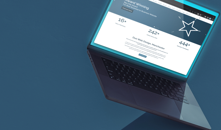
It’s been a while since we updated our website design. Finding some time between client projects we decided to spruce up our existing site. Below are some of the things we’ve done to improve our site for new and existing clients.
Better Accessibility
When assessing our old site we discovered numerous areas where we could improve accessibility. The contrast on our main navigation and footer links wasn’t quite as good as it could be. So we took this opportunity to revise the design to help make the text as clear as possible, while keeping the design in-line with our corporate id. We also made our slideshow system more accessible by adding accessibility labels to all the buttons, this enables screen readers to read out what the various buttons do eg. ‘Next Slide’, ‘Previous Slide’. The slideshow system is a component used across several sites, so these updates will benefit existing clients too.
Some examples

Footer Element Before

Footer Element After
Loosing Weight
Modern websites are getting seriously overweight. Every year the average webpage grows in size, now averaging 2.5mb. At the same time, mobile usage now makes up more the 50% of website traffic. At the time of writing, this site gets roughly 60% of its traffic from mobile phones. It’s those phones which are most likely to have poor or spotty internet connection, so would benefit most from smaller sites. With that in mind, we made it a priority to make our new home page lighter than ever.
One of the heavier elements of the old design was the main banner area. The slideshow had 6 large images, making up over a megabyte of data. We wanted to carry on sharing information about those key areas of work, so we swapped those images out with much smaller animated SVG’s. SVGS (scalable vector graphics) only need to download points and lines, so simple illustrations are much smaller than large bitmap photographs. It’s also possible to animate SVG’s so you can get a similar level of impact with much less data. At 20kb we’re downloading 50x fewer bytes than before.

Old Slideshow - over 1mb

New Slideshow - 20kb

Shouting About What We Do
We wanted new customers to get a feel for the sort of work we offer in more detail. We’ve had a big impact on many of our clients with our bespoke development, various integrations and design work and felt this should hold a more prominent position on our site. We have added a handful of brief service description to our homepage to help potential clients get a feel for this and direct them to more detailed information.
We’ve animated these services description in one at a time as the user scrolls to help emphasise each element individually. When possible we’ve again used SVG’s to keep the page light and download time quick.
Client Testimonials
We tend to have very happy clients who stick with us for a long time (many have been with us over 10 years!). Their opinion of us is one of our best sales tools. We asked for testimonials from them quite a while ago, but never got around to using them on our site.
This homepage refresh finally gives us a chance to do just that. So we’ve included 3 short testimonials at the foot of the page, to hopefully leave a positive lasting impression for all those who visit our site.

Conclusion
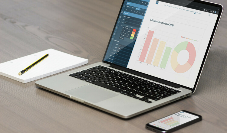
So we now have a faster, more accessible, more informative homepage. Hopefully you like these changes and perhaps they’ll give you ideas on how we can help you improve your website. This has all been authored within the DuoCMS editing system so these changes are easy for us to edit and keep up-to-date.
As a bit of a bonus we’ve also scored full marks on “Lighthouse” (Googles web page health check).

Lighthouse Scores Before

Lighthouse Scores After (yes, we get fireworks!)
